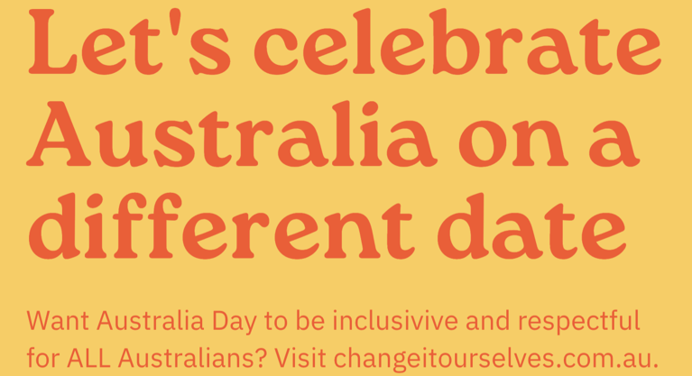
Some of the ideas you won’t hear from me this week…

I’m very frustrated right now, having just received an email telling me that my presentation at a conference on customer self-service has to be cancelled due to a contractual conflict with the conference sponsor.

I had been asked at short notice – last Monday – to stand in for another presenter, and have worked to put together a presentation looking at the principles to be applied to customer experiences to maintain their human-centredness, and avoid technology being the sole driver. Those ideas will no longer get a voice at the conference, but I thought I would share at least some of them here.

So, here’s a really high-level outline of what I was going to talk about…

Technologies shaping customer experiences
1. Mobile & mobility (inc. GPS)
2. Social
3. Internet access & use
4. RFID
5. Contactless cards
6. Mobile payments

Implications for customer experiences
1. Customers expect access 24/7, real-time
2. Expect customers to be informed, but don’t assume it. Information asymmetry will still exist, but it will be a question of desire, not capability.
3. If they can’t ask you they’ll ask someone; and probably first. The power of social networks for product/service research, customer servicing, and loyalty.
4. Information needs to flow, and follow the customer
5. Expect customers to jump between channels, but don’t force them to do so

Design principles
1. Use technology to do the heavy lifting – automate and streamline as much as possible
2. Understand your brand, and the power of interactions with a ‘real person’. Use them where they’ll have the most impact.
3. Don’t lock information into a specific channel
4. Look for analogs in other industries, and look at how they might be transferred and adapted
5. Use technology where there’s a clear value to the customer and to the business. It doesn’t make sense otherwise.


See also , , ,
Steve

Spatial Seduction by figure3

I was fortunate to have attended the wonderful and exciting Service Design Global Conference 2011 in San Francisco in late October, where Meld Studios also presented two presentations. The weather was lovely in San Francisco and I got to see a lot of the city which I haven’t seen before when I visited two years ago.

The theme of the conference was ‘From sketch book to spread sheet’. It focused on the exploration and discussion of what happens when service design meets business and how this relationship can be developed and grown into the future. Many speakers generously shared how they have implemented service design in an organisation including the struggles, ups and downs and solutions. Many also shared new tools and methods in how to approach future challenges in service design.

With my background in interior design, one of the presentations that resonated with me was ‘Spatial Seduction: Using Service Design to Rekindle Customer Loyalty’, presented by Jennifer Young and Andrew Gallici from figure3, an interior design firm focused on designing innovative spaces based in Toronto, Canada. It was exciting to see service design principles being used in the interior design industry where it is fairly unrepresented, and I hope that in the near future we will get to hear more about the use of service design in the built environment.

The process

Similar with service design firms, figure3 deploys a process that starts with a DISCOVERY phase, which involves scoping out the project as well as client and customer engagement and research. This phase is followed by a TRANSLATION phase where the findings, facts and stories are translated into insights and possible strategies that then inform the next stage of the process, IDEATION or design. The process ends with the REALISATION of the design, where the space is built and occupied by both the service provider and the customers.

In the presentation, Young and Gallici suggested that the environment is formed by the cultural, the behavioural and the spatial, and in the middle of the three lies the ideal user experience. This identification of the placement of the user experience is what makes figure3’s practice unique. Being an interior design firm, their design is not limited to the digital or the two dimensional, it is multi-sensory by nature. They are essentially creating an ecosystem that is inhabitable and three dimensional, and which also houses both services, customers, and the mechanisms that allows the service to be performed. As said by Young, it is to ‘Create an immersive customer experience’.

Case study 1 – Rogers Plus

In the two case studies that were presented in the presentation, Young and Gallici demonstrated how figure3 has used interior design and spatial planning to facilitate the service in the space. The first was Rogers Plus, a telecommunication provider in Canada, where the organisation has focused too much on the front end image and expectation to the customers through advertising and media, neglecting to match it to the service and physical store they were providing to the customers. The display cabinets that displayed cellphones and artifacts were locked and presented as artifacts similar to what we would see in a museum. This conveyed the perception that the products were too precious for customers to touch and interact. Through the creation of persona, fugure3 mapped out the environments that customers would be drawn to first and what kind of personal experience they would be expected to be welcomed by accordingly.

The outcome was a space where the the front of the store became the initiation point for conversations and engagement, where customers are free to touch and interact with the artifact and the back of the store provided privacy for more intimate and personal engagement between the staff and customer where personal product consultation can take place.


Redesigned Rogers Plus store. Image credit: figure3

Case study 2 – BMO

The second case studies was BMO (Bank of Montreal) where currently the tellers and customers are divided by a wall, which denotes the idea of ‘them and us’. The personal bankers, financial advisers and bank managers are enclosed and isolated in their personal offices with frosted glass. The overall atmosphere was unwelcoming and unfriendly.

The redesigned space aligned the space with the service. Young and Gallici described this interplay like dance choreography, ‘It’s about activating interaction in that space’. figure3 removed the physical obstructions to allow customer service to take place. Rather than dividing teller and customers with dividing screens or partitions, the partitions now casually divides each individual tellers, creating essentially an intimate and private teller station. The offices of each personal banker, financial adviser and bank manager is now fitted with clear glass with the staff all facing the entry into the space. The design not only changes the customers perception of the space and of the brand, but also changed how staff behaves in the space. As Young described ‘Everyone in this bank is a greeter’. Staff were not forced and going out of their way to provide the service, but rather they are naturally encouraged and facilitated by the environment to provide a welcoming experience and service.


Redesigned BMO branch. Image credit: figure3

Both design projects realised a change in the perception of spaces as well as change in behaviour in the space. This renewal provided an alignment of the space to the service they provide. With this in mind, if we look at it from another perspective, it’s to support the service, by creating an environment to optimise the service and consequently elevating the overall experiences. If anything these examples demonstrate how the unrealised potential within existing services can be changed through careful attention to the spatial interactivity of the business environment, without altering the essential service being provided.

See also , ,
Jono

The progress of interaction design

(Republished from interaction.ixda.org)

As the focus of the work of Interaction Designers has shifted from direct control-response interfaces to the design for behaviour and activity, the nature of our work has also shifted away from the design of discrete interactions to the consideration of complete, integrated systems.

These systems are comprised of many discrete pieces, with the object of design being the behaviour of the system as a whole. That system includes, necessarily and intentionally, the people engaged in those discrete interactions; and must – also necessarily – take into account the variability inherent in people.

At this scale, the impact of a change in one individual component or element of the system can have a disproportionate effect on the operation of the system as a whole. To use a scientific phrase, the system is non-linear. To address the design challenge inherent in such systems our approach must also be non-linear. The complexity of the behaviour of the system in response to changes in individual pieces cannot be fully anticipated or predicted using an incremental, linear approach. Direct causality is difficult, if not impossible to trace; and the impact of a change may not become apparent until long after the trigger event.

The introduction of Design methods, with an inherent non-linearity in the form of multiple, concurrent streams of concept definition, evaluation and refinement, appropriately addresses the uncertainty that exists when designing such systems.

In his recent post to Johnny Holland – Designerly ways of working in UX – Jonas Löwgren explores some of these Design methods, and how they manifest in the design of digital systems when merged with the more engineering-centric tradition of human-computer interaction and usability.

The applicability of these design methods, and the interaction designer’s understanding of designing systems that channel and shape human behaviour, can be seen well beyond the digital interfaces discussed by Jonas. These same basic principles are embedded in the educational program at theAustin Center for Design, founded by Jon Kolko. Now in its second year, AC4D is teaching students a form of interaction design that is more akin to social change, innovation and entrepreneurship than it does to the software and interface design of the mid- to late 80’s from whence Interaction Design was born.

The discipline is the same; the process is the same; the philosophy is the same. What we’re seeing in Austin is a more explicit recognition of the power of interaction design to humanise technology and truly embed people – both functionally and ethically – at the centre of the design process.

Interaction Design is maturing into an exciting, diverse, and rich design discipline with its own challenges, burning questions, and purpose. As we approach Interaction12 in Dublin in February 2012, I’m personally excited by the speed with which our discipline is burgeoning, and how the diversity of our practice manifests itself in the people and ideas on show.


See also , , ,
Steve

Design by Fire 2011

In October I visited Utrecht, the Netherlands, to attend the interaction design focused conference, Design by Fire 2011 (aka DxF2011). The conference was inspiring – from the detail in the design of the program booklet (PDF) showing a progress bar at the footer of the pages, to the unique 750 year old Geertekerk church venue, and from the enthusiasm, knowledge, and friendliness of the speakers, to the singing-troupe flash mob closing the conference.

Two strong themes that I picked up on during the conference included:

visualisations to connect people with information

Daniel Gross and Joris Maltha (Catalogtree) spoke about their approach to understanding and communicating data and told us that choosing a tool is a valuable design decision. They demonstrated how accessible stories emerge when they visualise data, such as the drop in parking violations following 9/11 by diplomats in New York City after they mapped the occurrence of 150,000 tickets over 5 years.

Jamin Hegeman (Adaptive Path) spoke about interaction design beyond screens and told us that his building blocks approach to design involve the consideration of affordance, feedback, behaviour, and emotion. He showed artefacts from activities created while designing within a neurosurgery environment which included mapping needs and emotions over time and creating service blueprints to communicate the experiences of all aspects of the service.

Matthew Sheret (Last.fm) provided examples of how to get people to access and act on information by revealing the human input, providing playful data (eg. How many really? by the BBC), and using a new tone of voice (he thinks that NASA = awesome for communications that encourage action). Referring to the “Powers of ten” video (that Janna also recently referred to in her UX Australia 2011 Levels of context presentation), Matthew told us to put the picnic at the centre of the data set, and that we need to put people back in picnics.

the responsibility of designers

Eric Reiss (FatDUX) spoke about the technological, social and political consequences of design and innovation, and reminded us that what we do will affect lives. He made a sobering point: if something is broken you can get a budget to fix it, but when it’s only mediocre it is hard to get a budget.

Jordi Parra (IDEO) recommended that when we’re re-designing things we need to consider what are the cornerstones of the existing experience that we want to keep. What happens to the current rituals that people have in relation to the product?

Didier Hilhorst (Flipboard) spoke about the “death of the input box” and how to create single tap or click experiences that delight. Design can matter a lot when a system is doing “magic” – set expectations and keep people informed of what’s going on. You should focus on creating great moments in the experience. As an example, the social aspects of a product need to be organic: consider what happens to the product if you take social away – if nothing changed then something is wrong.

A number of presenters also mentioned that just because we can build something doesn’t mean that we should. Our designs have consequences for the good and the bad and just because users or stakeholders ask for something doesn’t mean that it will be the appropriate solution. Nynke Tromp (Delft University of Technology) told us that we have a design responsibility and if we design something that the user wants and they get harmed then it’s our fault.


Thank you to the conference organisers, the speakers, attendees, and to Meld Studios for giving me the opportunity to attend Design by Fire 2011!

Links to some of the presentations are available from Design by Fire.

See also , ,
Niina

Picnic Festival, Amsterdam 2011

In September I was lucky enough to go to Amsterdam to attend Picnic, a three day festival of design, science, technology, media and business. This year the focus was on urban futures and how city development can be implemented in a more sustainable and human-focused way. Presentations were on issues across the broad spectrum of the theme from city planning, the use of data in the city, citizen engagement and sustainability. My pick of the presentations are listed at the end of this post along with links to videos of the presentations (if available).

Outside scene from Picnic festival with large type saying Amsterdam
Early morning on the first day of Picnic 2001.


For me, there were four re-occurring themes.

Collaborative development
Many presenters agreed that it is better to involve the end user in the planning of any product or service. Different ways were explored during the festival of harnessing user-knowledge such as workshops, participatory design sessions and gathering user-generated data. Waag Society from Amsterdam conducted a workshop called the User as Designer which looked at some of the participatory design methods that they use to collect user knowledge. This included Serious Lego (a method we have used at Meld Studios), scenario building and rapid prototyping. To read more about these methods you can view the book here.


A presentation during the User as Designer workshop.


Start small and scale up

In order to successfully implement new ideas in any city or community, speakers seemed to agree that it’s best to start small and scale up rather than trying to implement the whole kit-and-caboodle from the beginning. To show that collaborative development and participatory processes are worthwhile, speakers suggested working first on small projects to gain confidence of the client. If the process works then the client will have the confidence to hire you for larger projects. If the project fails, then the client will not lose face. A few speakers also suggested that calling something a pilot (or a pop-up) will help clients accept a project idea more readily as they will feel that it is only temporary and they do not have to over commit.


Get in and do it yourself

Allowing citizens to participate and contribute to the development and maintenance of their city by things like micro-volunteering was a re-occurring notion. Speakers called for a shift in perception that the government should be solely responsible for everything in the civic space and they looked for ways to convince citizens that they should take on some responsibilities in order to make their city better. It was an oft repeated statistic that 70% of the world’s population will live in cities by 2050, so designing now for this crowded urban future is essential.

This civic responsibility obviously needs to be assigned correctly, as it is not feasible for individual citizens to be responsible for things that require larger management (such as waste collection). But, there were many things suggested that people could do within their communities to improve the Third Place in which the public interacts. One idea was that people could have their taxes reduced in exchange for micro-volunteering.

Applications such as Verbeterdebuurt (Fix my Street) allow citizens to post an idea to improve their community and get their neighbours to vote on it. Any ideas with more than 10 votes are submitted to council as a petition.

A few speakers mentioned that publicising results is a very important part of collaborative development as citizens need to see that their work is actually getting results. At the Picnic festival, tweets were brought into the public space by way of a roaming whiteboard (see image below). This could be an interesting way in which data could be made public and is reminiscent of the Blackboard Blogger of Liberia who became famous for doing a similar thing on the highways of an information-starved country.


Live tweets on a roaming whiteboard at Picnic festival.


Designing for participation

How are places designed so that people want to interact and participate? Can we design a space so, as festival-goer Roel Simons said, “people can’t help but contribute”? Frog suggested one method via their Chroma interactive ecosystem where they designed the space so that visitors would have to run into the lights and thereby trigger a reaction that they would have otherwise been oblivious to. Kim van der Leest introduced the idea of the natural playground: child-friendly spaces designed with water and mud and lots of chances of unstructured play that are apparently more conducive to child development. I am still trying to work out how can we harness these ideas in our workshops at Meld Studios (minus the mud of course), and I’ll no doubt blog about this in the future.

I’d like to thank Meld Studios for sending me to the Picnic festival. I hope I’ll be able to return another time.

Sessions of note:

  • Redesigning the government: Maurits Kreveld, Peter Corbett, Ingrid Mulder, Ben Schouten, Marleen Stikker
  • Future Cities: Tracy Metz, Cathy Brickwood, Michiel de Lange, Carl Lens, Martijn de Waal
  • Another city is possible: Adam Greenfield
  • Green challenge lecture: Cradle to Cradle: William McDonough
  • The Green pillars of urbanization: Albert Boswijk, Kim van der Leest, Steven Olthof
  • Biophilia: Bjork’s App Album: Scott Snibe
  • Urban escape floating interview with Jake Barton, Adam Greenfield and Bonnie Shaw
  • (Re)defining new business models for future cities with Bruce Cahan, Auke Ferwerda, Gijs Libourel, Jaspar Roos, Isis Spuijbroek.


See also , , , , ,
kimberley

Meld Studios attending the Service Design Global Conference

Meld Studios is excited to have four studio members attending the Service Design Global Conference in San Francisco October 20th & 21st. Iain Barker and I will be giving a talk about service mapping, this time focusing on the value service mapping has for business. Steve Baty will be presenting about mitigating risk in innovation projects.

Take a look at the list of speakers and talks – it equally reflects the global nature of the attendees and event. Looking forward to seeing everyone there!

Janna

Levels of Context: The impact of zoom on the contexts we research, design for & implement within

I had the fortune of presenting on a topic of great interest to me – context – at UX Australia this past August. I was inspired to think about how we can best design with different levels of context in mind. Using Ray and Charles Eames’ “Levels of Ten” short film as a model, I discussed how zooming in and out to different levels of context impact how we think about what we’re designing, and have different factors of consideration at each level. I begin to touch on the impact of this zooming on the work we do, but it certainly warrants more discussion and consideration. I’m definitely not done with this topic – it keeps lingering.

Enjoy!

Janna

Service mapping: Understanding today, envisioning tomorrow, and planning a path

In order to deliver appropriate service to your customers, and for your customers to receive and experience the service as you intend, service mapping can provide you with three things:

  1. Current state: A reflection on the service you provide today, putting you on the path to assess and monitor how your organisation is delivering with current people, systems and processes.
  2. Future state: A vision of the service your organisation wants to be providing, reflect business strategy, customer need, and innovation of service delivery.
  3. Roadmap: Designing for the transition, how service delivery and customer experience can shift and be supported, putting your organisation on a pathway from current state to future state.

An artefact? A process?

A service map is both an artefact and a process, and it’s an important process that key service delivery stakeholders from your organisation should be a part of.   Rather than just seeing the map or reading the report, taking stakeholders, and customers, along for the journey of understanding can bring huge benefit to your organisation.

Regardless of which type of service mapping you’re undertaking, involving yourself with the design team exposes you to the services in action and your customers, creating an empathetic reference point for your work moving forward.

Where do I begin?

Do you start by understanding where you are, identifying opportunities for change from that current-state base? Or do start by looking strictly forward, creating a future state that is based on business drivers, strategy, and innovation, serving as an aspirational piece for your organisation to make impactful change? This question came up recently with a client, and the answer lies solely in what your organisation is intending to do after this exercise. A few examples follow.

Map current state first if:

  • Your organisation only has an appetite for incremental change and wants to build off of your current base. It doesn’t prohibit innovation, it simply starts by utilising your existing strengths and identifying gaps, weaknesses and opportunities for change.
  • You don’t understand what services you provide. There are many companies that simply don’t have a holistic view of their service offering, with departmental and organisational silos preventing cohesion and understanding. Seeing how these services do, or don’t, reflect the overarching vision of the organisation is a powerful tool for instigating future change.

Map future state first if:

  • Your organisation needs an aspirational vision of service delivery. If your organisation is open to exploring what could be with little to no initial constraint, starting with your future state is the way to go. This is beyond a strategy piece; it is an experiential vision of what your organisation has to look like in order to provide the ideal customer experience that you’re putting forth.
  • Your organisation is in need of innovation and change. With the ever-expanding commoditisation of products, service delivery is often the key differentiator between competitors. Envisioning your organisation as a service organisation, beyond the product, can often be the change you need, and may be more achievable than you think.

Map the roadmap first if:

  • Your organisation has an established service vision and knows where it currently sits. If your organisation knows where it wants to go with its service delivery, you can create a transition plan that highlights what needs to be put in place over time to get there. Each transition can reflect the service values you aspire to to some extent, working your way towards the fully-realised vision.

There are naturally nuances and degrees to which all of this can be done. You need not do this across your entire organisation; it can be undertaken at a specific service delivery point or can encompass an entire customer journey. Regardless of your scope, there is a place to begin, and we’re happy to meet with you to discuss the best pathway for your organisation.

Janna

Oh what a week!

It’s been a hectic but exciting week for the Meld Studios team. We’ve kicked-off two new projects, we’ve been doing research in Toowoomba, and we’ve hired a fantastic new designer. Here’s to a relaxing afternoon sketching ideas for our new office space.

alison

Showing the story behind the data

The name Nicholas Feltron will be familiar to many people, many more than might have thought they’d be interested in looking at graphs. His annual reports graphically chart the story of his year: from the food he’s eaten (30% animals with fins; 37% with legs in 2007) to the cumulative miles traveled (38,524 miles in 2008) and plants killed (4 in 2006 including 1 cactus). Feltron’s swiss-clean design aesthetic is beautiful, yes, but it’s the story behind the graphs that make his reports so appealing and utterly intriguing. Feltron has demonstrated that numbers can be interesting if the stories behind them are revealed. Without the story and his amusing juxtapositions, they’d just be a random list of inconsequential data. Continue reading “Showing the story behind the data” »

See also , , , , , , , ,
kimberley